Saturday 29 September 2012

Milan

Milan fashion week has been a whirlwind of print, sophistication and colour. From Moschino's short A-line shifts of Sixties Pop, to Cavalli's transition into a new direction.

The inspiration for Moschino's collection was clear. the Pop art sixties theme was most certainly the best way to start of the week, with bold contrasts of cropped jackets, dresses and mini-skirts, bringing the iconic era back to the 21st Century. Beginning with mono-chrome pieces, the first outfit which entered was a matching white mini dress and cropped jacket, featuring black piping in all the right places. Stripes were in high demand throughout the show, as well as the feature of diamonds, hearts, block colour and heavy piping.


Domenico Dolce and Stefano Gabbana chose Sicily as their inspiration once again, this time full of colourful prints, bright colours, but still keeping the tradition.


The collection consisted of fine detail and bags of the tradition, expressed through print, accessories, and as my increasing obsession remains, in the shoes.

The split in the collection was clear; the tradition shown through tourist-like prints, historical images, with flowing skirts and high neck lines. Compared to the Sicilian beach styles, with stripes, more traditional prints, high-waisted shorts and bandeau tops. All of which were paired with over-sized earrings, beautifully colourful detailed wedges and flats, traditional bandannas, and festive wicker-basket bags.


Roberto Cavalli's SS 13 show consisted of beautiful floating silks, yet this time without the clashing prints we normally see. His signature use of denim and animal print was still in use, but in a more subtle, calm way, despite the use of pink lace and neon dresses.  This saw the focus more on the looks, with coiled up trousers and lined shirts.


Georgia Armani focused on soft tailoring and purified colours, carrying on with an aquatic theme, even giving his models blue/silver style beret hair.

Dontella Versace presented once again a lavish, glamorous collection, consisting of a new way of channeling lace-lace panels on silk dresses, lace panels on shoulders, lace that ran down jeans, there was a clear experimentation going on with lace. My favourite amongst the looks were the floor length flowing gowns, paired with straps of tough studs going length way on the shoulders, and those repeatedly used strappy boots.


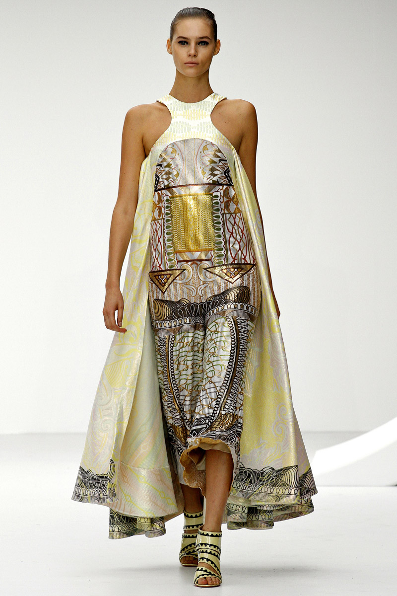
Peter Dundas carried on with taking the rains on the Emilio Pucci collection for SS 13, and did not disappoint. Even though the brands iconic Kaleidoscopic image is one leading back to the 1960's, Dundas has started to create a new iconic image for the brand, edging away from this assumed certainty. Now becoming for known for Dundas' confident, new found glamour, expressed through graphic swirls and geometries.
Not completely rid of its archival prints, the collection is explored through bomber jackets, floor length gowns and loose pants, giving across a somehow vintage look. And interesting collection and a favourite of the week.


Monday 17 September 2012

Burberry Prorsum

The Burberry trench coats were nothing but perfection this season once again, with capes playing another big part in this seasons collection. Varying in colour from fuchsia, maroon, raspers, deep and grass greens, gold, cerulean and purples making a number of appearances.
The opening of the show was just as beautiful and exciting as the end, beginning with pitch black darkness, when suddenly as if the heavens had opened, the daylight came flooding in with a model standing centre stage in a white cape at the top of the runway. The appropriate opening was almost expressing the transition from A/W to SS 13 with a click of a button.
The use of texture and colour were varied in the show, with models walking out in metallic classic trench coats in varied colours, transparent 'Vinyl and metallic python' handbags and cat-like sunglasses. A trench that caught my eye and a shift in tradition from the original Burberry trench, was a metallic shaded body con, producing new found shape in a trench. With a small collar and loose belt at the waist.
New uber mini cape like jackets which clung to the shoulders were an added extra, creating volume and layers, appearing in plastic versions which hovered over the shoulders too. Volume was also created in the jackets and trench coats with exaggerated sleeves. The focus on the waist was also present, with super short bomber jackets stopping just above and at the waist or on the shoulders, as well as high waisted pencil skirts and body tight cocktail dresses. The repeated use of metallic was something I was not expecting from Bailey, but something that most certainly sums up our British summer. A beautiful collection for Burberry Prorsum, with an exciting use of colour, very British and very well done.

No explanation describes the collection, unless of course your Christopher Bailey. See for yourselves;

http://uk.burberry.com/store/shows/?WT.ac=LP_SEPT_H_B1_R2R-SHOW#/ss13-womenswear/show


Christopher Kane The Great

One of my favourite British Designers, Christopher Kane has done it again, this time with a twist of Frankenstein? Mary Shelley's Frankenstein believe it or not was Kane's inspiration for his SS 2012 show, in particular the 'nuts and bolts.' And nuts and bolts he did use, with folds created on dresses in clean cut lines, and were fastening's once lied, actual bolts replaced them.
One clean crisp white Jacket resembled something of a straight jacket, with a belt cut in at the waist, but feminised with a white quilt-like texture. With a colour palette consisting of whites, buttercup yellows and pale pinks, the feminine colours met hard with the Frankenstein theme of 'nuts and bolts'. Frills, bows, layering of materials and antique-like Jewels were also used among these ideas, again clashing with the creative theme, yet working oh so well. Textures other than the quilted material as mentioned in the Jacket which opened the show, as well as the plastic looking substance shown below. Nuts and bolts replaced buttons, cufflinks, handles of handbags and were placed on shoulders-anywhere and everywhere.
The creativity of this man has gone through the roof, combining femininity and Frankenstein, not your everyday match, and somehow made it desirable to the female eye. Can not wait for the A/W 2012 collection, only time will tell what will come down the catwalk for that collection. Can't wait.


Topshop's show stoppers

 We're half way through the shows in the Topshop show space area, and the talent is pouring in. Starting off the set yesterday was Topshop Unique, commencing with Jordan Dunn in a shear white longsleeved dress, whilst the setting of the Topshop space was discovered. Featuring a futuristic space ship setting including a minimalist white oval catwalk,  and consecutive white LED lights appearing in sync. Something that struck me about the collection this year was the maturity and growth, and extreme wearability for a wide range of ages. The simple colour palette of white to greys, buttercup yellows, pale pinks and navy blues gave a simplicity to the pieces, but when matched with the subtle patterns of  stripes, block shapes and checks, it gave variety and interest to the collection. The range of shapes was another interesting aspect, with baggy and oversized jumpers matched with short bodycon skirts, or tight skirts and bra-like tops paired with an oversized coat. Overall a fresh, mature collection from Topshop Unique, heralded by new creative director Kate Phelan, British Vogue fashion director. Maybe its time for a more mature look for the youth buyers of Topshop? 


Followed by Mary Katrantzou, who's decisive collection featured an impressive use of print and shape, with ankle length skirts, shirt collars, open sleeves and fitted trousers. Katranzou also used some repetitive layering, of tops layered over trousers of the same print, similarly done with tops and skirts. Later on, the show displayed a more relaxed sense of shape with floating skirts and dresses giving a sense of freedom. Yet the focus of the collection was, of course, the use of that incredible digital print, which coloured the garments from head to toe. These impressive pieces were more like works of art, digitally generated and sculptured by computer generated technology, onto the catwalk. This revolutionary artist has created perfection once again, with her SS13 collection becoming one of my unexpected favourites, well done Katrantzou.


Day two of Topshop's show space epic three days and we begin with Peter Pilotto, putting his statement on the catwalk with a printed floor instead of the usual lit-up white effect. Pilotto seemed to be another exploring prints, but in this collection, there seemed to be a lot of colour and print clashing, resulting in another experimental and explorational collection. A favourite piece for me was a printed jumpsuit, with a block shaped open pattern towards the upper part of the garment, and black and white ruffles opening at the waist. Another clever collection from one of Britain's finest, full of wonderfully clashing prints and colours for SS 2013.

Michael Van Der Dan was the next into the limelight, who again seemed one for mixed print and colour, adding younger girl femininity, matching his RTW show with white alice headbands and petite shoes with different coloured fur on the heels. His use and image of deconstruction and then re-constructing the garments to work with different materials comes through, and is successfully re-worked. 


Louise Gray's show was no exception from her previous works, full of vibrant colours, fun accessories and exciting new brogues. This alternative show consisted of a variety of exploratory ideas, patterns, textures and colours, all mixed up and produced in the SS 2013 collection named, Trust me . As wacky and creative as this collection was, it somehow works in a way that in Topshop will sell! The overstated dramatic use of colour is so overwhelming its almost not enough. Another great run for Louise Gray. 


The final Designer of the day was J.W Anderson, keeping his understated style, opening the show with ruffles and Doc Martin-like shoes. Although I am not one for the understated and in a lot of cases not agreeing with the statement less is more, J.W.A's collection proved to very wearable yet stylish, putting his stamp all over the collection.

All of this, and we still have Meadham Kirchhoff tomorrow. 2pm sharp Topshop fans, you won't want to miss this. 

Sunday 16 September 2012

LFW

Day three at LFW
Day three and London Fashion week is well underway, with highlights for me being Lucas Nascimento, Marios Schawb and of course, Vivenne Westwood's Red label collection, with her spectacular show, focusing on Climate Revolution. 


Only one year on in his second year at London, and Nascimento has hit LFW head on, with his occurring sweetheart necklines, range of prints, and subtly ombre woven pieces, giving the collection a beautiful range of experimentation. His range of shapes and materials-knit wear that from a far you would not believe so, made his collection wide and well explored. His pieces ranged dramatically from simple a-line pieces, focussing of shape and texture, to knit wear pieces hitting hard with the softness of a sweetheart neck line and pastel colours underneath. One of my favourite pieces was his simple yet so beautiful lime green jumpsuit, focusing solely on the silouette with that feminine neckline. Contrastingly, on the right above, is an example of his oh so familiar knit wear again, hitting hard against the sweat heart neckline of a green bra-like top underneath. In total Nascimento's collection was one which has inspired me from the day, full of clean, contrasting ideas. Someone who I will be keeping an eye on for future greatness. 

Westwood has made it quite clear in the recent years that what she really cares about, and what she only really cares about, is her platform for change, and chance to voice her opinion, and for her collection in London 2012, it is Climate Revolution. With her O so busy set, vibrant head pieces created by Stephen Jones, and daring mixture of colour, pattern and texture, I felt the show had a sense of happy randomness that couldn't help but make you smile. With her appearance at the end, draped in a brown cloth, which she took off and held up reading, Climate Revolution, she definitely got her point across. 


One of my favourite designers is Mathew Williamson, and he most certainly did not disappoint. With the very British back drop of St Pauls Cathedral setting the scene, the show opened with Cara Delevingne in a stunning merging blazer, of a deep blue splashed with white red yellow and turquoise, paired with a flattering pair of structured shorts and gold embellished heels. With a lot of soft tailored shapes, short skirts, cropped trousers and floating dresses summed up the show with his signature usage of colour, pattern and embellishment. With the use of mosaic-like patterns, and floating shapes he matched with the more structured tailored lines. 
The colour palette was something I felt worked very well, with his extensive use of blues merging into whites, yellows, and the use of turquoise and reds. 
If I could have anything from the catwalk of day three, it would have to be from Mathew Williamson, 15 years on still creating brilliance.